Problem Statement
While an increasing amount of users are using not just laptops, but phones & tablets to browse websites,
a lot of websites are capable of supporting a reponsive experience
How can we redesign a website so that it is usable & accessible to users on all kinds of devices?
Overview
In this project, I redesign the official website of East Providence, RI.
This is an essential website for residents who want to learn about local policy updates, news, unemployment aid, information on tax filings & water bills, etc.
Therefore, it is important that such a website is both usable & accessible; unfortunately, that is not the case.
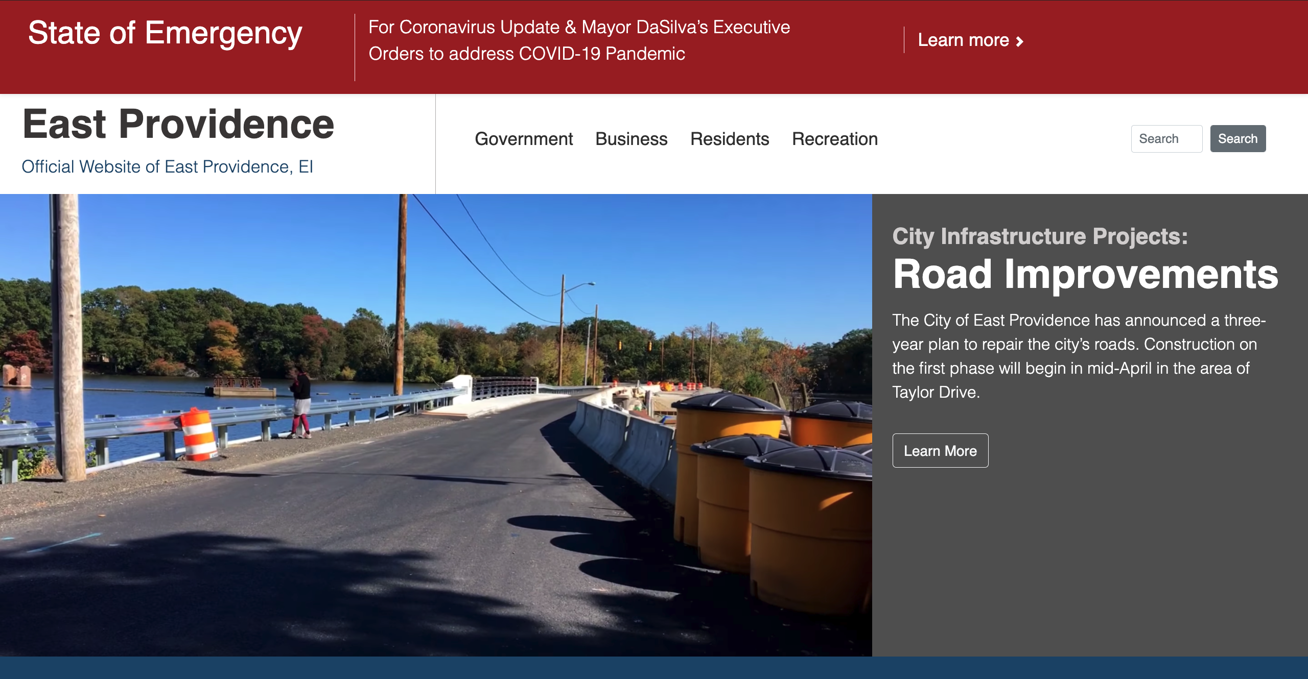
Shown below is the website before vs after the redesign:

Problems
The original website exhinits a few problems, causing it to have low usability, learnability, memorability & accessiblity:
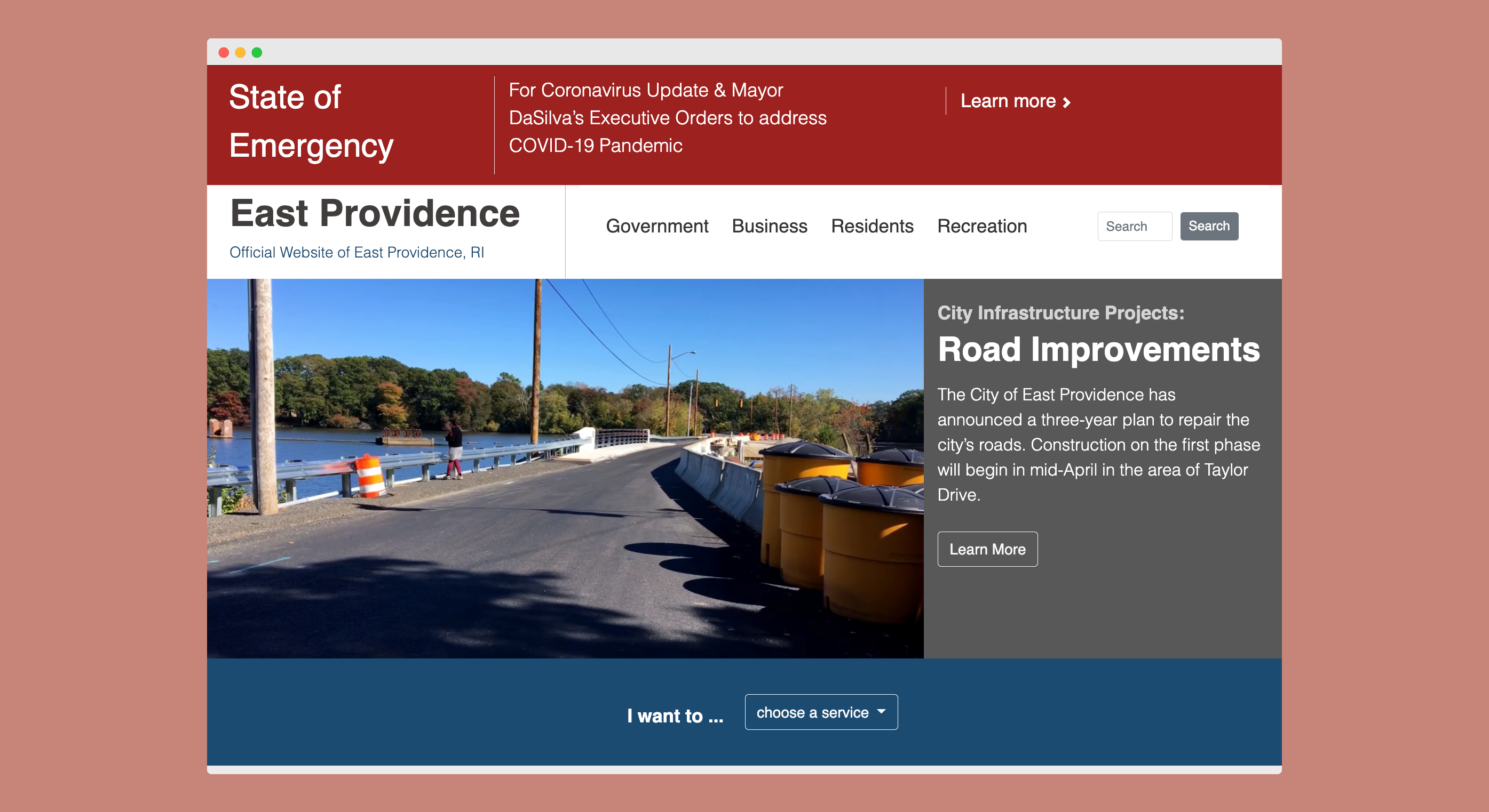
The COVID-19 emergency banner takes up 50% of the screen & is colored in an irritating bright red.
The title of the website “East Providence” is shown against a colorful background, decreasing readibility
Users don't know where to focus on because the enter of the website lacks focus and is packed with photos, videos & new articles
Information/Links are scattered everywhere without clear grouping & organization
The website doesn't specify which langauge it is in its header file, which can make it difficult for screen readers to read the content in the appropriate language and/or translate it for visually-impaired users.
Design Iteration I: Lo-Fi Prototypes
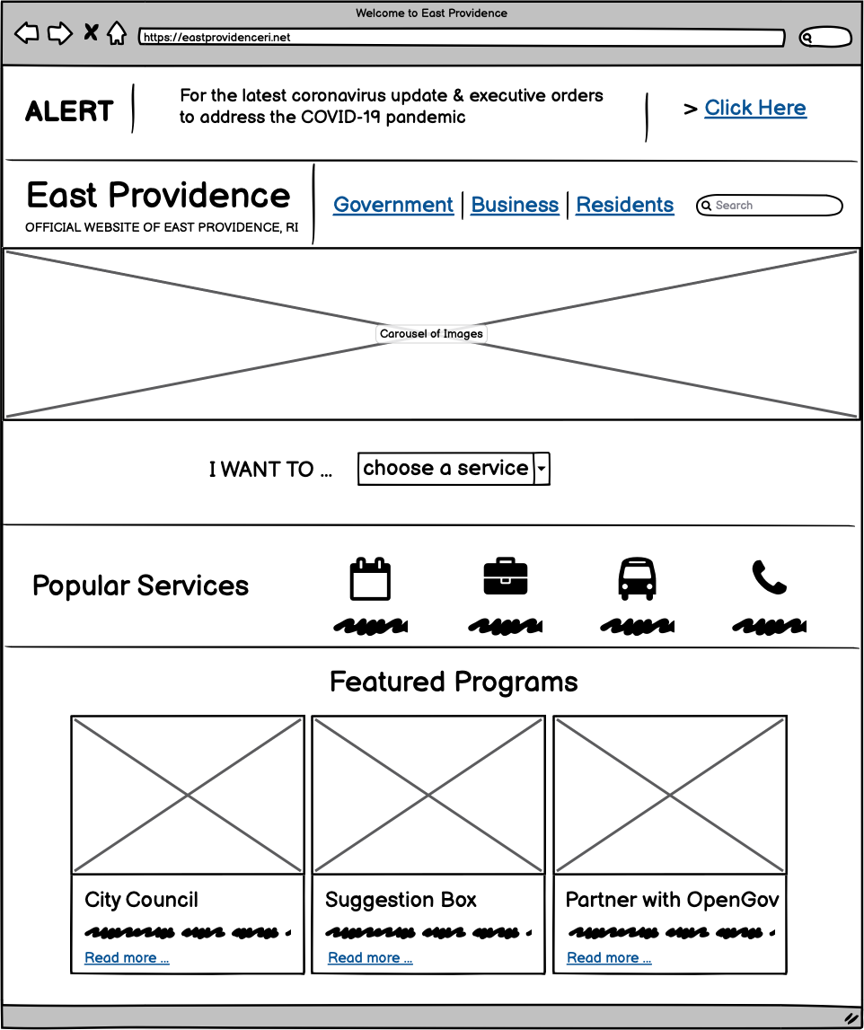
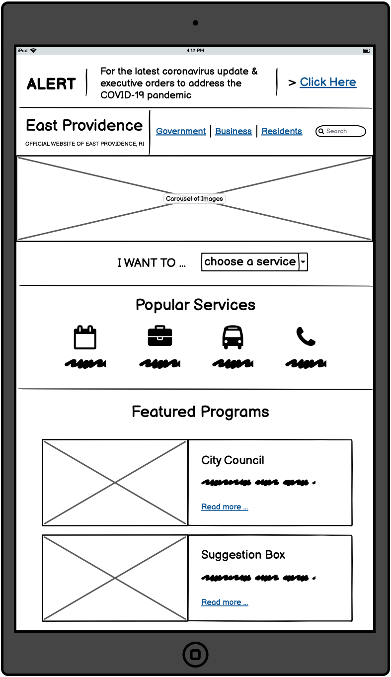
I first constructed lo-fi prototypes for the redesigned webpage in desktop view, tablet view & phone view.:
Creating a lo-fi prototype allows us to make a decision on the general layout of the website, and how it would change responsively.
* For annotations on design choices, check out the full project page linked above

Design Iteration II: Hi-Fi Prototypes
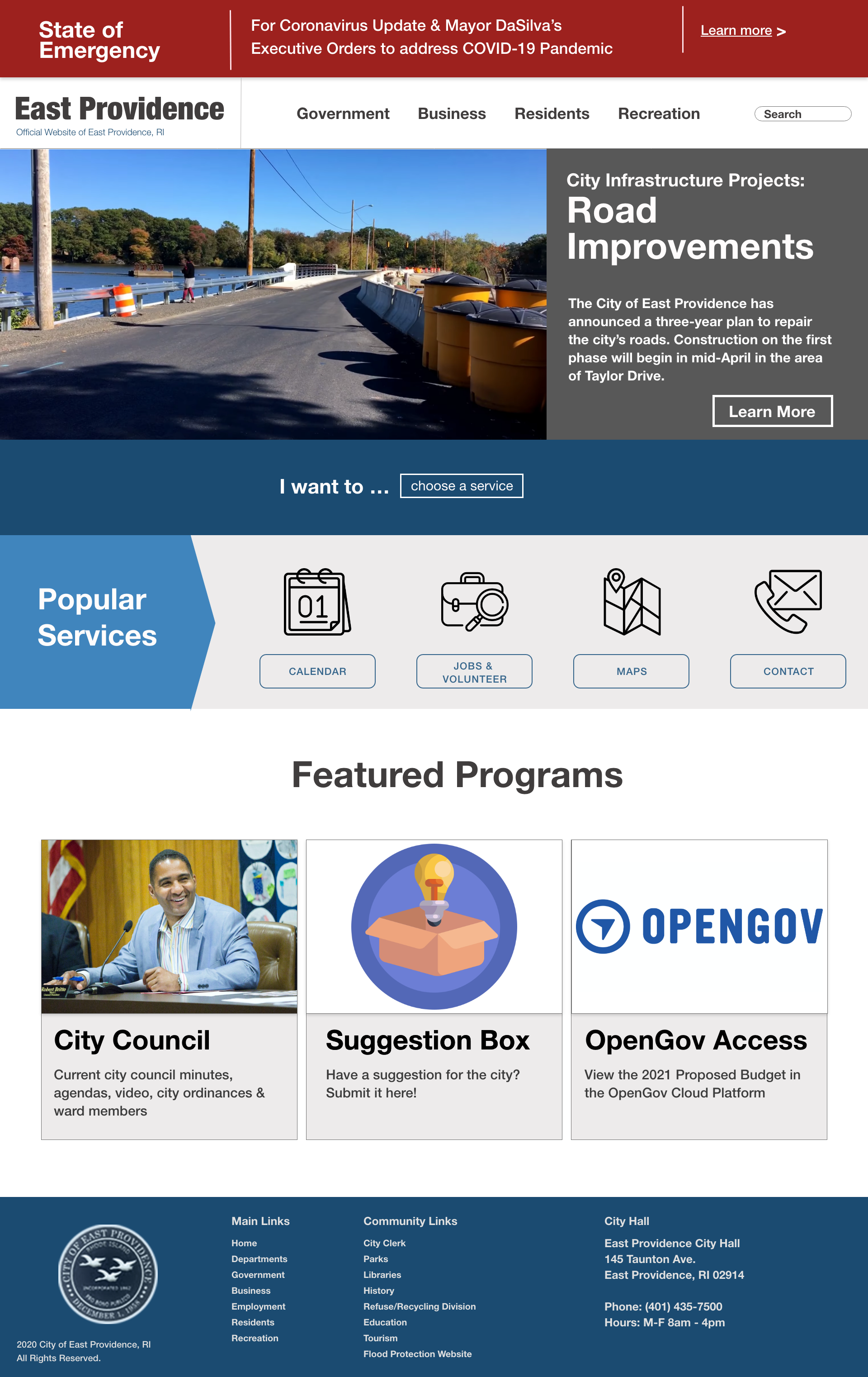
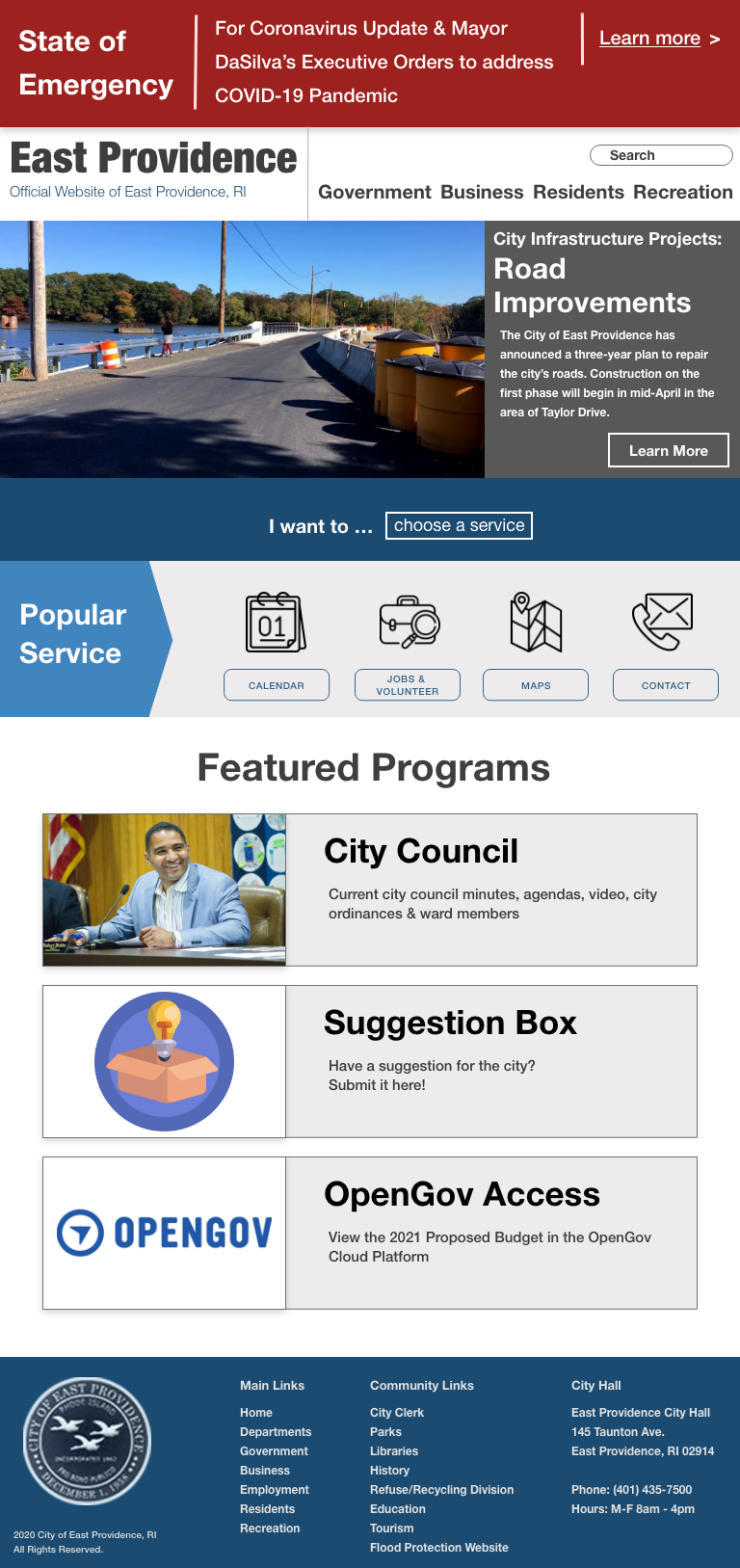
I then constructed Hi-fi prototypes, paying more attention to details such as the color palette, buttons, etc.:
* For annotations on design choices, check out the full project page linked above

Key Conclusions
Responsive design is not just about adjusting font sizes; sometimes in order to make the look more natural and easier to navigate on different devices, we also need to reorder & reposition components in a different way.
Going through numerous design iterations allows us to discover various types of usability issues at different stages, narrowing the scope one step at a time.

