Problem Statement
Given only the concept/business idea of the startup, without looking at their design/app, how can we design the most usable interface for it from scratch?
Overview
Statiq is a company based in the New Delhi suburb of Gurugram, India and a member of the YCombinator Class of 2020. It allows individuals to find & reserve Elective Vehicle (EV) charging stations through its app.
Essentially, it aims to build India's largest EV charging network.
We decided to design a mobile app for Statiq due to the following reasons:
Users will most likely be using the app when they're on the road, looking for EV-charging stations nearby.
Users can use the map and navigation features of the app to get to the chosen stations using the phone.
Features & Goals
Our goal is to build an app that is easy to use, especially to first-time users, and provides a streamlined process of booking stations.
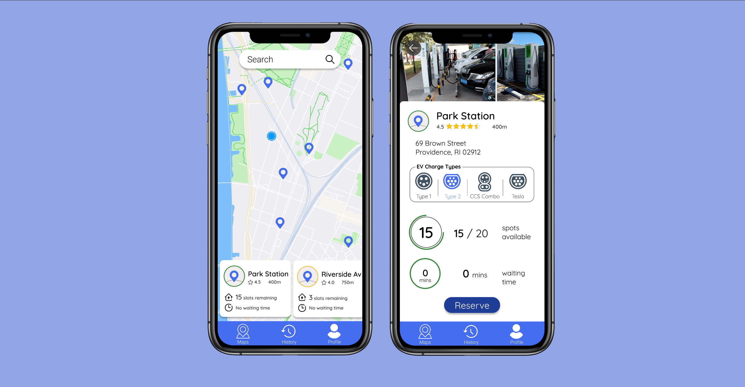
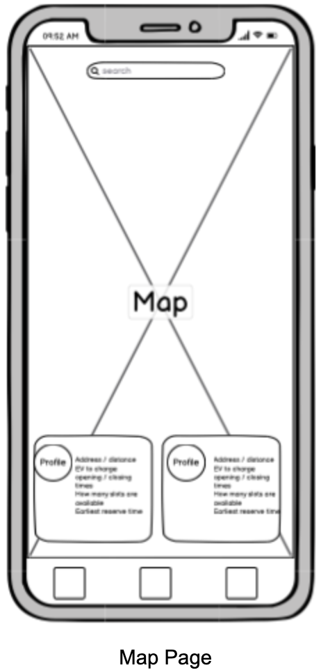
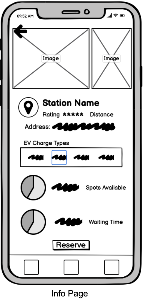
In order to do so, we decided that the app would have a Google Maps-like interface (since most people are already familiar with it) to show various charging options near the user's current location & show the availability, waiting time, distance, rating, types of EV that can be charged to help users choose which station to go to, and a navigation feature to bring the user to the station.
Target Users
We think anyone who owns an electric vehicle could benefit from this interface as it helps them locate charging stations faster and make reservations easier.
Design Iteration I: Initial Sketches
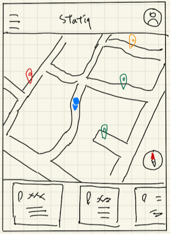
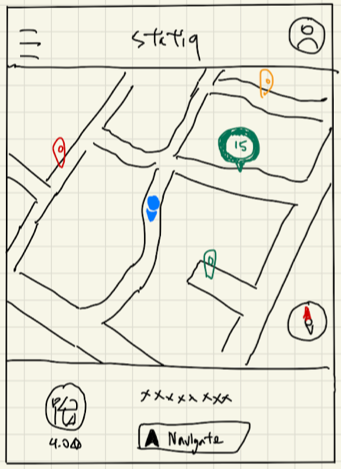
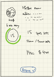
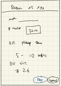
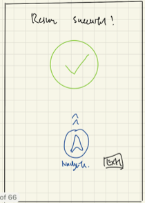
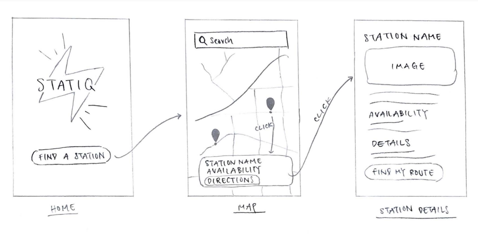
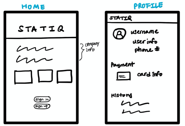
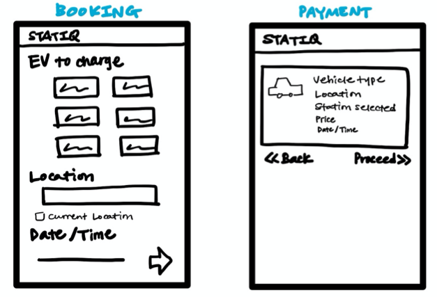
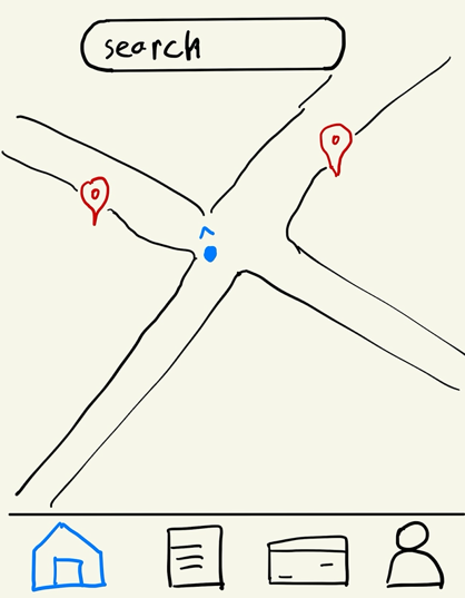
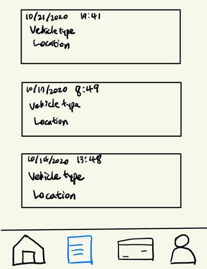
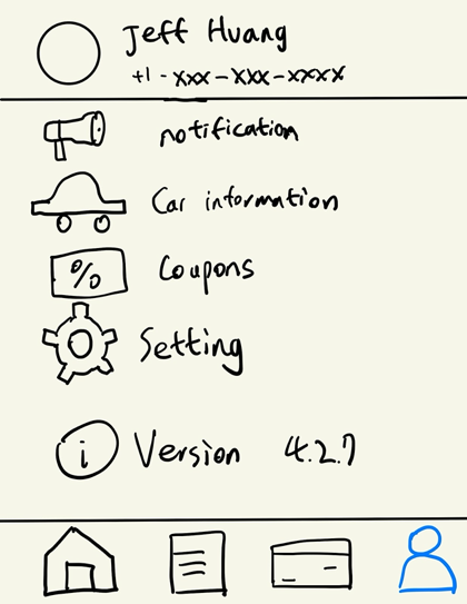
Each member in our group brainstormed a set of 3-4 screens in order to start off with a diverse set of possible layouts.
Coincidentally, a few of us ended up focusing on much different aspects of the app: some had more detailed reservation processes, others touched on things like past reservation records, personal settings, etc.
The set of sketches are shown below:
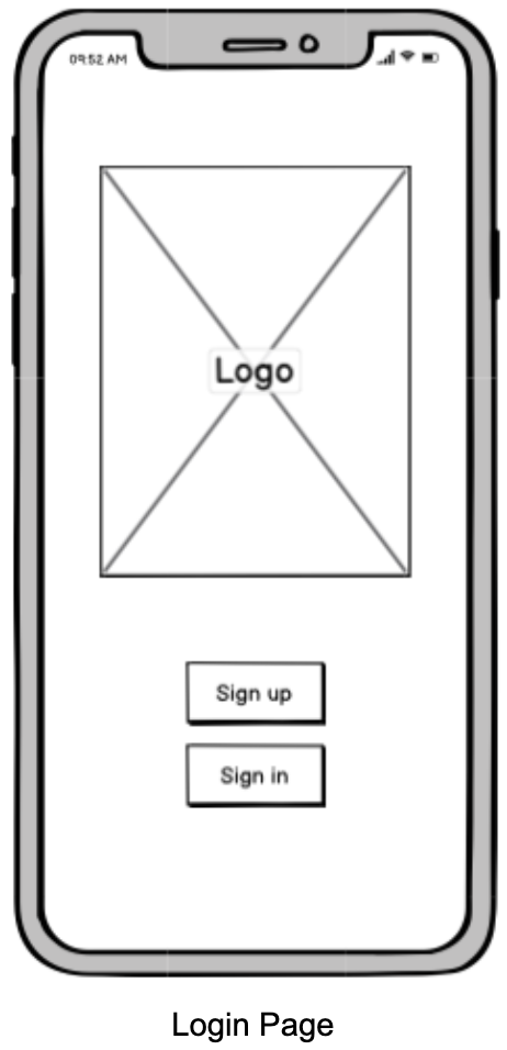
Design Iteration II: Lo-Fi Wireframes
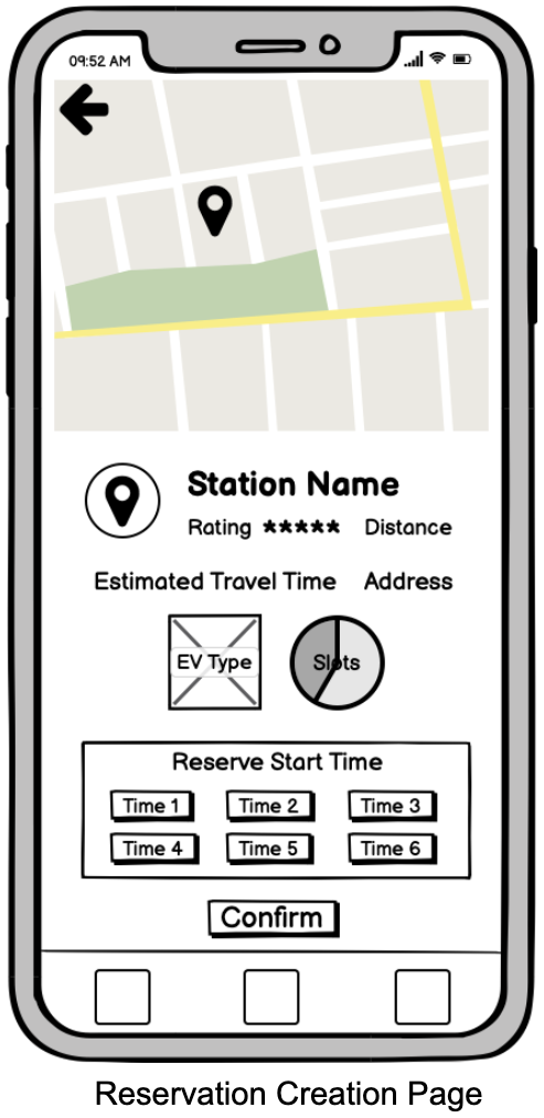
We merged selected pages & designs from each set of sketches to build an interface that demonstrates our solution to the startup's goal of reducing pollution by connecting the users & owners of EV charging stations.
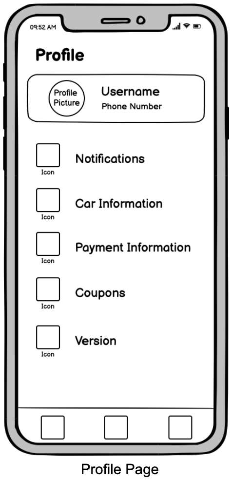
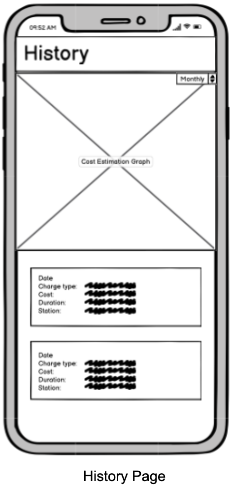
We categorized each functionality into groups, and designed a navigation bar at the bottom that contains the 3 main feature groups: the Map Page, Profile Page, and History Page.
The set of sketches are shown below:

Design Iteration III: Hi-Fi Interactive Mockup
We then created an interactive Hi-Fi mockup based on our wireframes, actually implementing the layout, buttons, screen transitions and more.
Design Iteration IV: Incorporating Studio Critique
We brought our interactive mockup to studio & received feedback & suggestions on how to further improve the app. We then incorporated these feedback into our design.
Studio Critique
- It has good affordances and is easy to navigate.
- Clarification needed on why it is necessary to show waiting time: if there are empty spots, shouldn’t there be no waiting time?
- Suggestion to change the graph of monthly spendings to a map of locations/stations visited.
- The “Swipe Up To Navigate” option at the end of reservation is a bit confusing because users are unsure whether that refers to a separate navigation mode or if it just brings them back to the homepage map.
Improvements Made
- Stations that have available spots will show “No Waiting Time”, and the app would only show an estimated waiting time for stations that are currently full.
- We decided to stick with showing a monthly cost estimator because price would probably be the primary concern for new users. Users can also see the locations they visited through their own charging history
- We changed the directions from “Swipe Up To Navigate” to “Swipe Up to Enter Navigation Mode” to make it clearer that it is a separate functionality (and not just returning back to homepage).
Design Iteration V: User Testing
We uploaded our mockup to UserTesting.com, where, given a selected task & a set of questions, real users from around the world will try to accomplish the objective on our app, and give us feedback by answering our interview questions.
Main Objective: Reserve a Type 2 Charger at Park Station @ 3:45pm
Task Questions
- Without clicking on them, what do you think the buttons/icons on the bottom navigation bar do?
- On the page showing "Reservation Confirmed," if you were looking to go to the charging station, what action would you take next?
- Throughout the process, was it clear & intuitive which buttons/items to click on in order to complete the task and move on to the next step?
Feedback Questions
- What did you like about this prototype?
- Is there anything particularly confusing about this prototype?
- What would you change to improve the prototype (making it easier to use/navigate)?
- Is there anything you want to talk about that has not been asked?
Results
- We observed that users typically made little to no errors and have no trouble navigating through the process on their first try, sometimes completing the next steps intuitively before even being asked to or given hints.
- The fact that most users were able to successfully complete the task on the first try, some even without needing to consult the sub-tasks, shows that the interface is intuitive enough and has good affordances that allows users to know how to go from one step to the next.
- Users also gave positive review when asked the interview questions: most of them thought the app was really inuititve and easy to use, and, throughtout the process, there were no major parts where they felt confused.
Potential Changes for the Next Step
Besides changing the navigation text instructions from "Swipe Up to Naviage" to "Swipe Up to Enter Navigation Mode" to make it clear that navigation is a separate functionality that is different than the maps homepage, we could also consider adding an additional screen in our hi-fi mockup to showcase what the specific page would look like to users
Key Conclusions
Receiving user feedback is incredibly important to making an inuitive app with good user experience. The effects of a lot of design decisions remain largely ambiguous until actual users share their feedback from a different perspective from the designers.
Having multiple iterations allows us to make modifications to our groundwork design early on, and get feedback on features throughout the development lifecycle.

